Why Color Psychology Matters in Design
Introduction
Color is often the first element people notice about a brand.
Before reading a headline or understanding a message, the human brain reacts to color.
In branding and visual identity, color is not a decorative choice — it is a strategic decision. It influences perception, builds emotional connection, and shapes how a brand is positioned in the market.
Understanding color psychology allows designers to create identities that communicate with clarity and intention.
Color Shapes First Impressions
Studies show that people form impressions within seconds. Color plays a major role in that instant reaction.
A brand’s color palette can communicate:
-
Trust
-
Energy
-
Luxury
-
Stability
-
Innovation
-
Sustainability
When chosen strategically, colors align the visual identity with the brand’s personality and values.
The Meaning Behind Common Brand Colors
While color perception can vary across cultures and contexts, certain associations are widely recognized in branding.
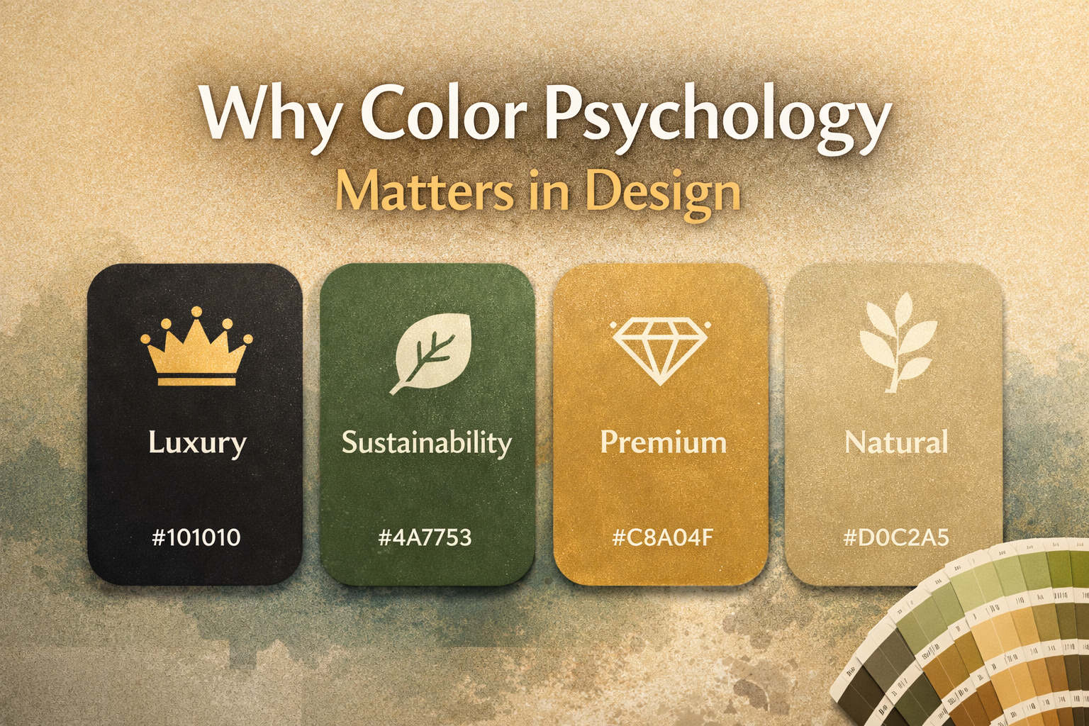
Black
Represents sophistication, authority, and elegance. Often used by luxury or premium brands.
Green
Associated with growth, sustainability, health, and balance. Frequently used in eco-conscious or wellness brands.
Blue
Communicates trust, reliability, and professionalism. Popular among corporate and technology brands.
Gold
Suggests exclusivity, prestige, and high value.
Beige and Neutral Tones
Create softness, minimalism, and a refined aesthetic often seen in modern luxury branding.
The power of color lies in how these meanings support the brand’s positioning.
Color and Brand Positioning
Color does more than attract attention — it differentiates.
Think of brands like Coca-Cola with its iconic red, Facebook with its recognizable blue, or Starbucks with its signature green.
Their colors are not random choices. They reinforce emotion, identity, and recognition.
Over time, consistent color usage builds strong brand memory.
Strategic Color Selection in Visual Identity
When developing a color palette, several factors should be considered:
-
Target audience
-
Industry standards
-
Brand personality
-
Cultural context
-
Emotional impact
-
Digital and print adaptability
A well-structured palette typically includes:
-
Primary colors
-
Secondary support colors
-
Accent tones
-
Neutral backgrounds
This ensures flexibility while maintaining consistency.
Consistency Strengthens Recognition
Color must remain consistent across:
-
Social media
-
Packaging
-
Website interfaces
-
Print materials
-
Advertising campaigns
Inconsistent color usage weakens identity and reduces recognition.
Strategic consistency transforms color into a brand asset.
Conclusion
Color psychology is not about trends — it is about intention.
When applied thoughtfully, color enhances communication, strengthens positioning, and builds emotional connection with audiences.
A strong visual identity begins with understanding the psychological power behind every design decision — and color is one of the most powerful tools available.